
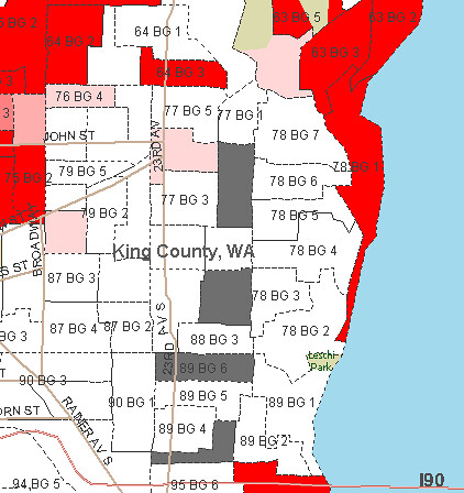
Remapping Debate has created an interactive map that allows you to visualize the diversity or segregation of a city down to the block. The images attached to this post visualize the “% Black (non-Hispanic)” in each Census area. Data is from 2005-2009.
What I find fascinating about the map on a city-wide level is the way geography and segregation in Seattle go together. The areas with good views on the tops of hills or next to water appear less likely to have large black populations.
 On a more neighborhood level, the difference between Capitol Hill and the CD is pretty clear on the map. Madison is a fairly firm divider between the two. The CD appears to be the north end of a path of diversity leading south through Rainier Valley.
The map shows that the neighborhood is diverse, but a lot has changed since the Civil Rights Movement of the 1960s. The following map, from the UW website, shows the segregation of the city’s black population in the Central District in 1960:

“The areas with good views on the tops of hills or next to water appear less likely to have large black populations.”
Decades ago I was told that if you could see the water from your house your school child wouldn’t be bussed.
As with the Red/Blue state maps, the colored swatches can be misleading, as they can represent very different numbers of people. Extreme example: the red area at the end of Discovery Park probably only represents the half-dozen or so people who live/lived in the lighthouse keepers cottages? Or does it include the (soon to be demolished) military housing?
Best way to represent the data is to have the area of each swatch proportional to the # of people represented. Works great with the red/blue states map.
Nope, it’s just the lighthouse keepers! (unless someone lives at the sewage works)
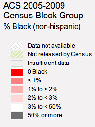
Yes, the map is far from perfect. I wish there were more gradation. Gray kicks in at 50% or more black, but white represents all areas between 3% and 50%. Seems like there could be some other steps in there, but maybe the data isn’t there. I don’t know.
Tom:
Did you create the legend? I also think that is incredibly misleading, as the orange represents less than 1% and the black represents over 50% – terribly unequal to compare and better gradations would be more valuable.
Absolutely not. That was created by Remapping Debate. I believe they are trying to map the extreme areas as a statement on continued segregation (or lack thereof) across the nation. I did not make the map, just took a snapshot of it.
They have teeny tiny populations of 0, 1%, 2%, 3% and then it takes this enormous, VAGUE jump of “oh, somewhere between 3% and 50%!?” That’s almost too nonsensical to take seriously, especially since it’s followed by another huge jump of 50% and up. Very strange way of breaking it down…seems kinda lazy!
There’s also a fun interactive feature at the New York Times that explores demographic and other data from the Census Bureau’s American Community Survey (2005-2009). It gives a little bit higher resolution graphics. And you can scroll though the individual tracts to see everything from racial breakdown to median income to the percentage of families sending their kids to private school
( http://projects.nytimes.com/census/2010/explorer?ref=us)
that is what will be interesting and not just in terms of ethnic groups. But, data showing where people live by #s of persons, children, income and all sorts of things will be fascinating. How does it match projections?
The percentages of the shadings were adjusted to show the data better. Because the black population in the north end is so small, if the shadings were evenly divided most of Seattle would be all orange. It’s funny and sad that the modern census map doesn’t look too different than the 1960 segregated map. It shows the black population moving south into the valley but not spreading out otherwise. 50 years has not made much difference in the city as a whole when looking at black/white. I would be interested to see a map with all of the ethnicities represented. I think that would tell a different story for the last 50 years.
Check out this map Ryan linked to from NYT. It shows other ethnicities. http://projects.nytimes.com/census/2010/explorer?ref=us
Not true. I grew up in Madrona with a 3 story view of the lake, and my 3 brothers and all all were bussed to horrible, north end schools.