
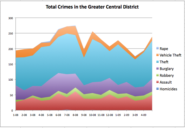
The city is getting a lot better about releasing crime stats on a reliable schedule, and today we noticed that the May numbers are available. Overall there’s a seasonal rise in most categories of crime, usually attributable to nice weather and longer days, with total crimes up 7% year-over-year, and up 23% compared to April of this year.
Here’s the details:
- Assault: Up 47% year over year, 43% vs. April 2009
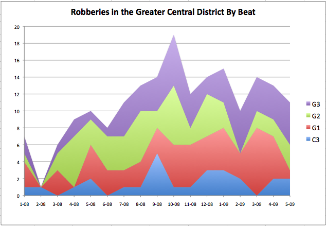
- Robbery: Up 10% vs. May 2008, down 15% vs. April 2009
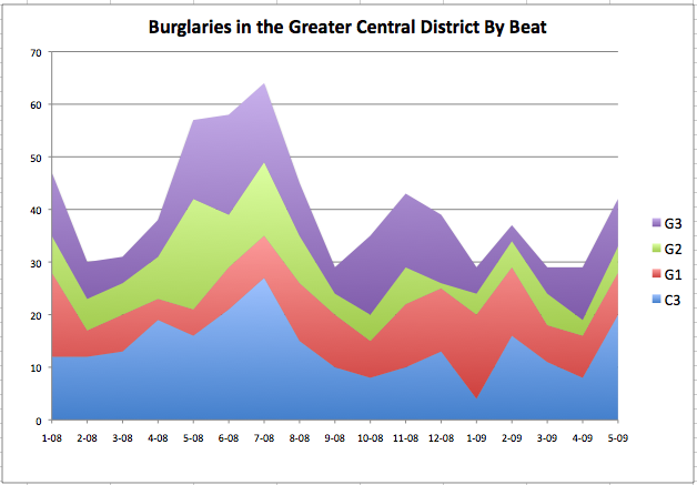
- Burglary: Down 26% vs. May 2008, up 45% vs. April 2009
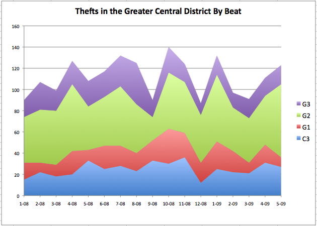
- Theft: Up 13% vs. May 2008, up 11% vs. April 2009
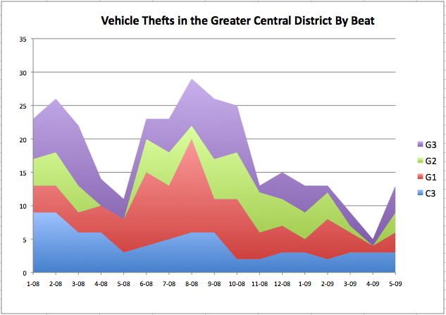
- Vehicle Theft: up 18% vs. May 2008, up 160% vs. April 2009
Police recommend being extra vigilant about property crimes during the summer months, and to take simple steps to protect yourself:
- Never leave valuables (or their various cords & accessories) in your vehicle
- Always lock the doors and windows of your home, even if you’re outside working in the garden, etc
- If you have an alarm system, use it
- Be aware of your surroundings when on the street, and don’t let ipod headphones distract you and/or make you a target
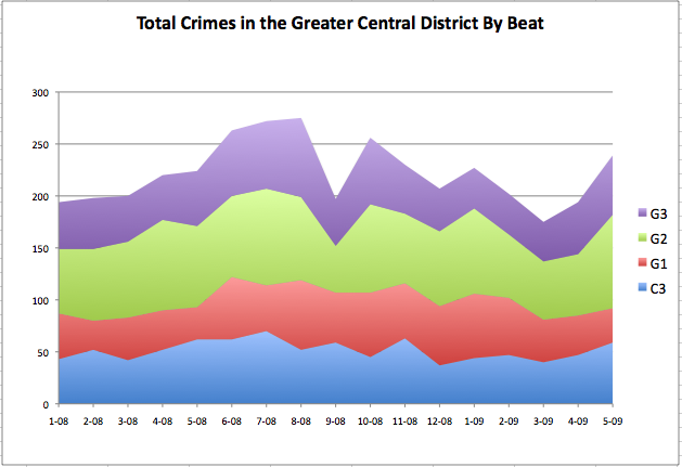
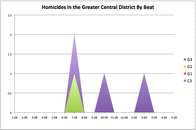
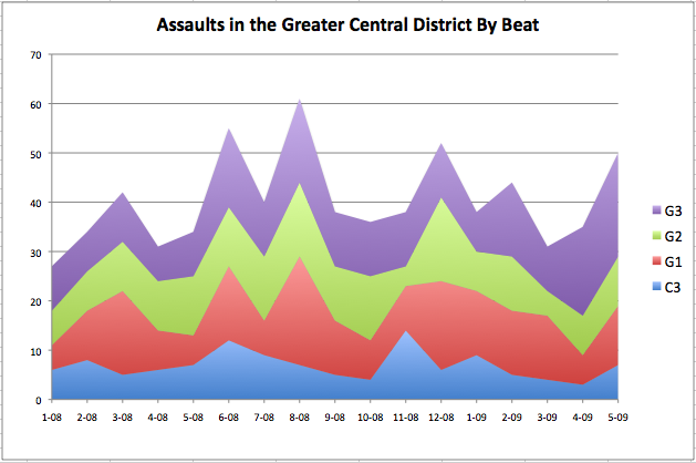
Here’s the detailed graphs for the various police sectors in the neighborhood:
yeah!!!!!!!!!!!!!! he’s taken the lead on global warming!!!!!! yeaaaahhhhhhhhh!
Are there explanations somewhere of what/where/when each beat (G1, G2, etc) covers? I’m assuming these are geographical subdivisions? I’d like, particularly, to know where G2 is as that has the highest incidence of theft, whereas G1 and G3 seem relatively theft free by comparison.
http://www.seattle.gov/police/images/Maps/East_Print.pdf
and maybe i’m not the brighest thread in the sweater, but these might be the hardest to read and ugliest set of graphs i’ve ever seen. for example, in the last graph where does bright green start and end? around 37-110? i get the point, but there has to be a better way than these horrible graphs
To fully disclose, I work there. Our software is designed to help people visually understand and analyze data. If the person who made these graphs will send me their info, I’ll set you up with a free license to see if it will make things better for the CDN readers.
http://www.tableausoftware.com
Send to me on [email protected] and mention the CDN in the email subject line.
Happy Tuesday!
Mooandoink, they’re really just comparative trend graphs. They’re not designed to give precise numbers, just to show the trends and relative rates for different categories on the same graph. It’s an alternative to multiple side-by-side bar graphs because it also displays the sum of the categories.
It’s high level overview stuff, to be sure.
From those numbers it looks there were ~275 rapes in August of 2008, or almost 10 per day. Is that true? If so then it is pretty frightening! I never see them reported in Central District News but am definitely concerned now …
http://www.seattle.gov/police/crime/TrendReport/East/09_East
Not sure why the graph is incorrect but what a relief!